7 T-shirt design mistakes to avoid
Even the best ideas can fall flat if the execution is poor. Whether you’re designing your first tee or expanding your product range, these are some common mistakes that can hurt your chances of making a sale.
Poor font choice

Your font isn’t just there to spell out a message—it sets the tone for your entire design. Using fonts that are too thin, overly stylized, or hard to read can instantly lose a customer’s interest. A font that looks great on screen may not always translate well to fabric.
Test how your typography looks on real product mockups, and choose legible styles that match your brand aesthetic.
Too many colors or overly complex designs
While creativity is key, overcrowded designs with too many colors or elements can feel chaotic and cost more to produce. Stick to a limited color palette and prioritize clarity. Customers are more likely to purchase a bold, focused design than one that’s trying to use every color, font, and shape in the world.
Unflattering contrast
Contrast helps your design pop, but if it’s off, it can ruin the entire look. Pale text on a light shirt or clashing color combos can make your design hard to read or just plain uncomfortable to look at on your website. Even great graphics lose impact if the colors blend into the background.
Before you publish a product on your site, preview it on different t-shirt colors and ask yourself, would someone actually purchase and wear this? If you’re unsure, try using mockups or testing out small runs to see what your audience responds to. Good contrast isn’t just about color—it’s about creating balance and clarity that makes your design pleasant to look at.
Plain photos on a t-shirt

Photos can work on t-shirts—but only when used thoughtfully. Generic or low-res images often fall flat, looking pixelated or uninspired. To make them stand out, apply filters, crop creatively, or layer with hand-drawn elements or bold text.
Think about the story or emotion behind the image, and design around it. Test how it looks on different shirt colors, and avoid anything that feels like a stock image.
Mixed-media designs are trending in 2025, blending photos with other elements to add depth and personality.
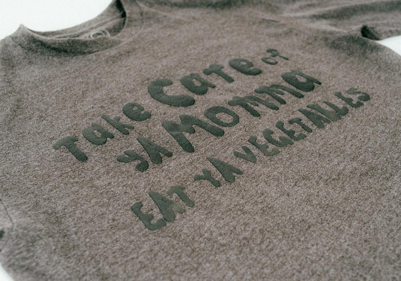
Wonky placements
Even the best design can be ruined by poor placement. Prints that are too low, off-center, or awkwardly sized make shirts look sloppy.
Always use mockups to preview how the design fits across different sizes and styles—what looks right on a small tee or hoodie may shift on a 2XL. Align your design thoughtfully with seams, collars, and sleeves, and visualize it on a real person.
Center chest and upper-left prints are go-to options, but creative placements can work if they feel intentional. When in doubt, order a sample before listing the t-shirt design on your website—it’s a simple way to ensure quality and reduce returns.
Overused clipart

Free clipart can be a useful starting point, but only when used intentionally. Generic icons and overused phrases often feel lazy or outdated, especially if shoppers have seen them elsewhere.
To make clipart work, align it with your brand and audience. What feeling should it evoke? Does it match your shop’s tone? Customize by tweaking colors, adding texture, or pairing with original typography to give it a fresh look.
Avoid relying too heavily on default design tools. When everyone in the t-shirt market has access to the same assets, standing out and meeting demand requires adding your own personality. Even small edits can make your design feel polished and unique to your brand.
Inaccurate mockups
Mockups help customers imagine the product, but only if they’re accurate. Over-edited or unrealistic previews can set false expectations, leading to returns and lost trust.
Stick to clean, true-to-life mockups that reflect the actual print and shirt color. Showcase your designs on diverse models, in real settings, and from multiple angles. Authentic visuals build credibility and show shoppers your brand is the real deal.
5 Tips for creating fantastic t-shirt designs

While trending shirt designs can boost short-term sales, evergreen styles will keep you earning in the long run. Here are six tips to help you create designs that’ll sell no matter what the latest trend is.
1. Understand your target audience
Great design starts with knowing who you’re designing for. Your audience’s interests should shape everything—from your message and color palette to placement and print method. Are they into bold statements, clean minimalism, or niche lifestyle themes?
While personal style matters, focus on what your customers want to wear. Use tools like Etsy, TikTok, and Google Trends to spot what’s trending in your niche.
A clear understanding of your audience helps you avoid generic ideas and customize designs that they can’t wait to purchase.
2. Choose the right decoration technique
The decoration method you use has a big impact on your final product. For complex, detailed, or full-color visuals, opt for printing methods like DTG, DTF, or all-over printing—they deliver rich color and clarity.
Embroidery offers a premium, textured look that complements more minimalistic designs. Always match your design to the technique to ensure it looks sharp, wears well, and meets customer expectations.